Zapovednik app audit
We conducted a UX/UI audit of the Zapovednik mobile app. The main goal was to identify user experience and interface issues in order to propose solutions to improve them.
As part of the work, we analyzed the current version of the app, identified problem areas and offered specific recommendations. The main focus was to optimize the interface, improve navigation and enhance usability.
Main stages
1. Interface analysis
We examined the current implementation of the application in detail:
- Checked visual consistency of elements.
- Analyzed user scenarios.
- Tested the application on different devices
2. Problems we have identified
Based on the analysis, key problems were found:
- Interface inconsistency with modern design standards.
- Unclear navigation structure, which makes it difficult for users to find the necessary sections.
- Overloading of the interface with secondary information.
- Problems of adaptation for devices with different screen sizes.
3. Problem Visualization
To clearly demonstrate the problems, we have prepared screenshots with notes and examples of flaws.
Examples:
| Problem | Reason for elimination | Solution |
|---|---|---|
| Heder pulls principles from the web to the mobile app. | ||
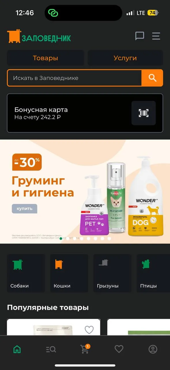 | Takes up space. Is an unfamiliar pattern for a mobile application. | Get rid of the header. Logo is not needed, it is not common to use it inside the application. There are unlimited resources on the web, so the user needs to understand where he is. But here he is limited only to those applications that he downloaded, so it is much easier for him to navigate, the need for a constantly hanging logo is eliminated. Chat and the rest of the functionality under the burger menu can be moved to the profile |
| Level 2 and Level 3 sections consist of text only. | ||
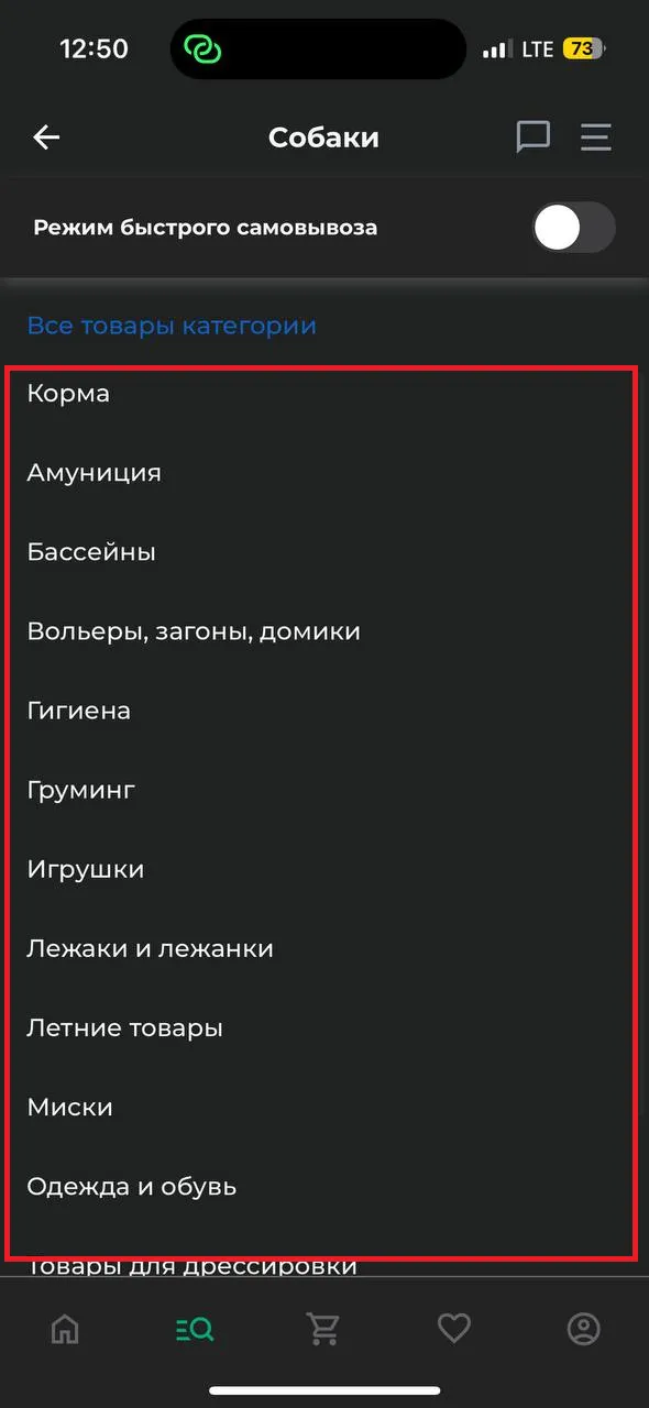 | Many people find it convenient when textual information is duplicated by visual information. Especially when you need to find something in a long list. | Use real or neural network-generated images. |
| Apply button narrow | ||
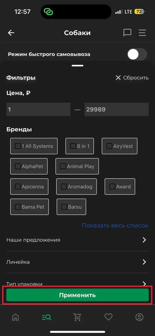 | Small pressing area + unaesthetic. | The recommended minimum size is 40px. |
| Sorting by name doesn't make sense. | ||
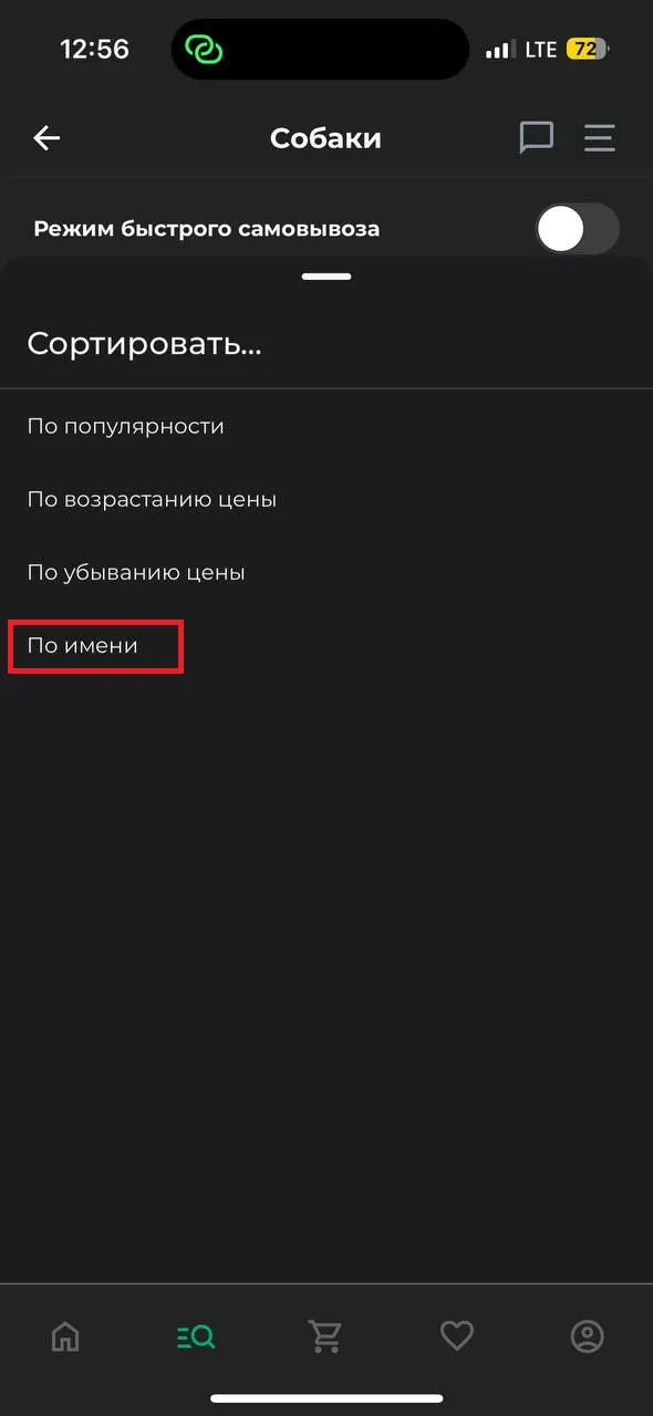 | Superfluous functionality. | Remove sorting by name, because if the user needs to find a specific item, he will use the search. And so such sorting can be useful only for goods with the letter A. |
| In the empty state, the call to add to favorites is too “dry”. | ||
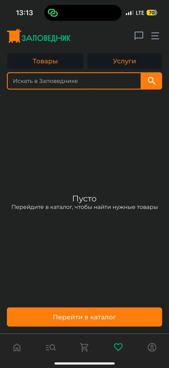 | Doesn't motivate to add products to favorites. | Revise the text so that it sounds positive but motivates to add products. For example, “Your favorites are empty for now. Add products from the catalog, so you don't lose them”. You can also add an illustration. |
Result
Our report allowed the client to understand the main problems and see possible solutions. Visualization and clear recommendations became the basis for further improvements of the application. The customer makes a decision about the items he would like to change.
Examples:
| Problem | Reason for elimination | Solution | Result |
|---|---|---|---|
| Add to cart button narrow. | |||
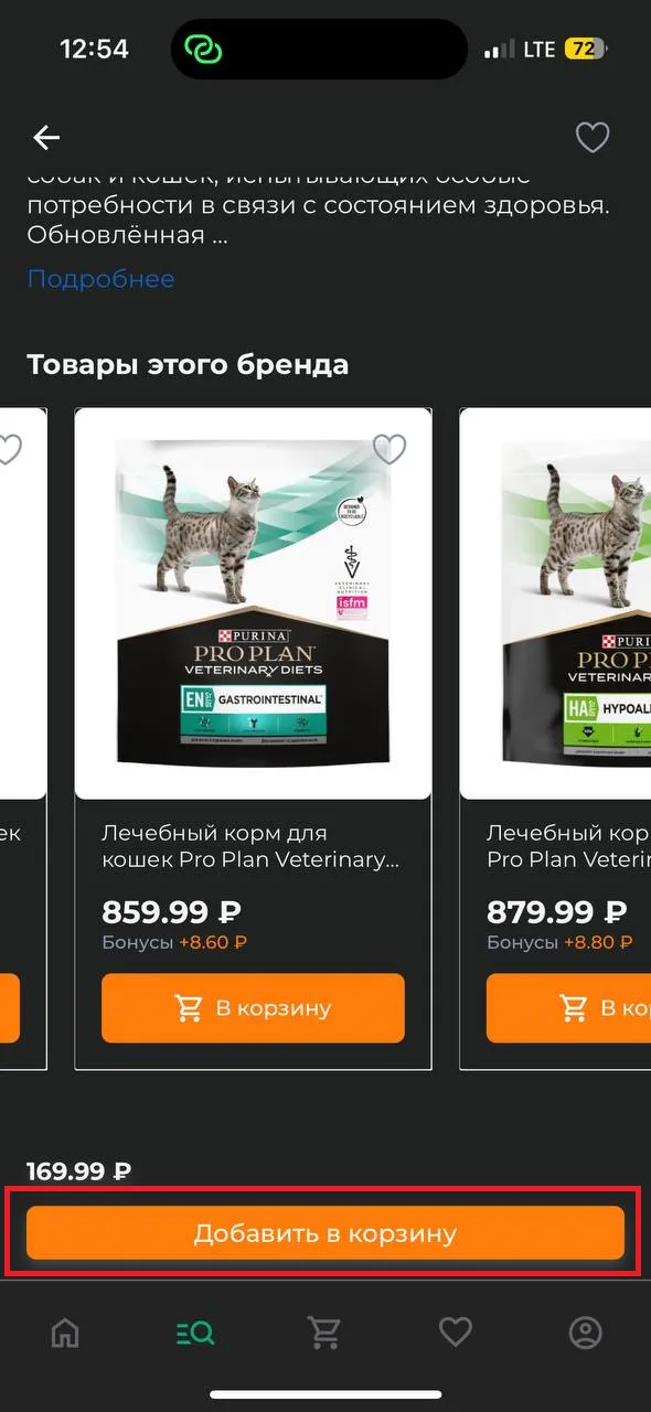 | Small pressing area + unaesthetic. | The recommended minimum size is 40px. | 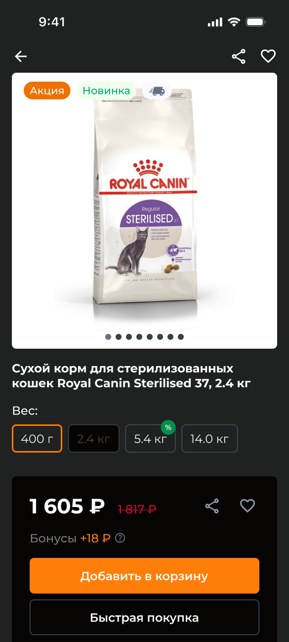 |
| Two searches on one page. | |||
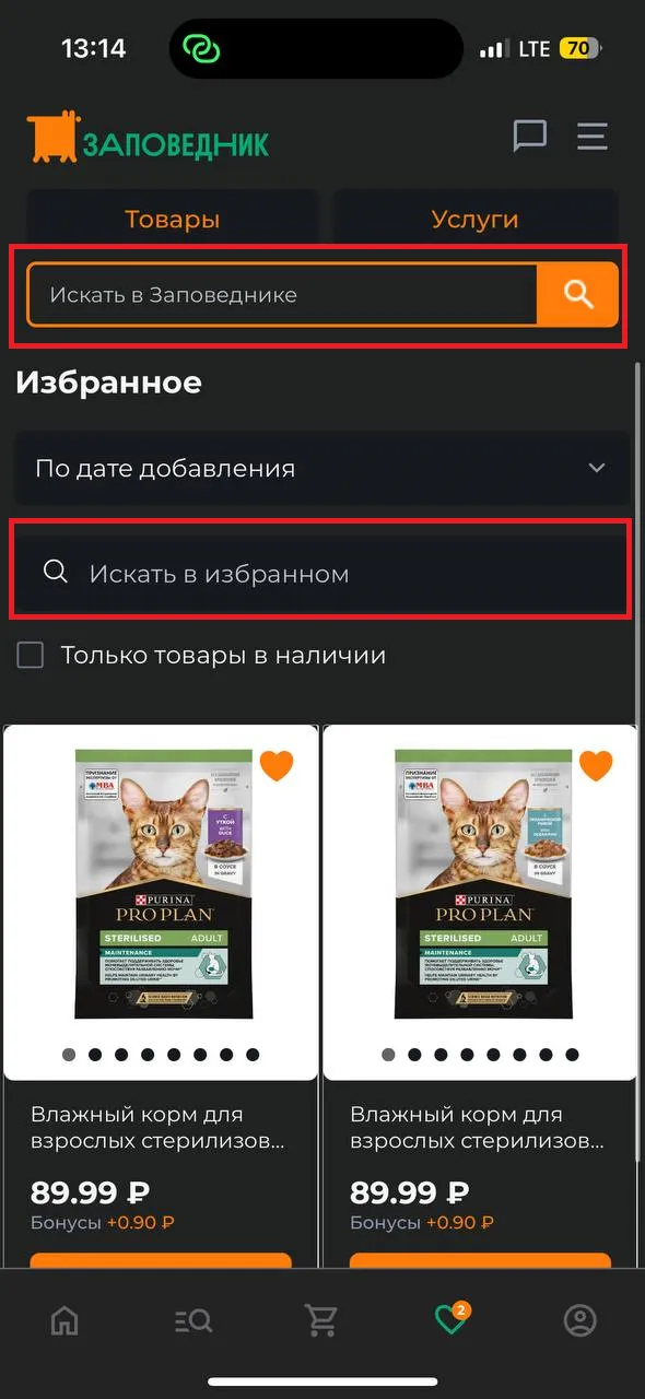 | Confuses the user. | If a user is in the favorites section, he probably only wants to search within the section. The general search should be abandoned. | 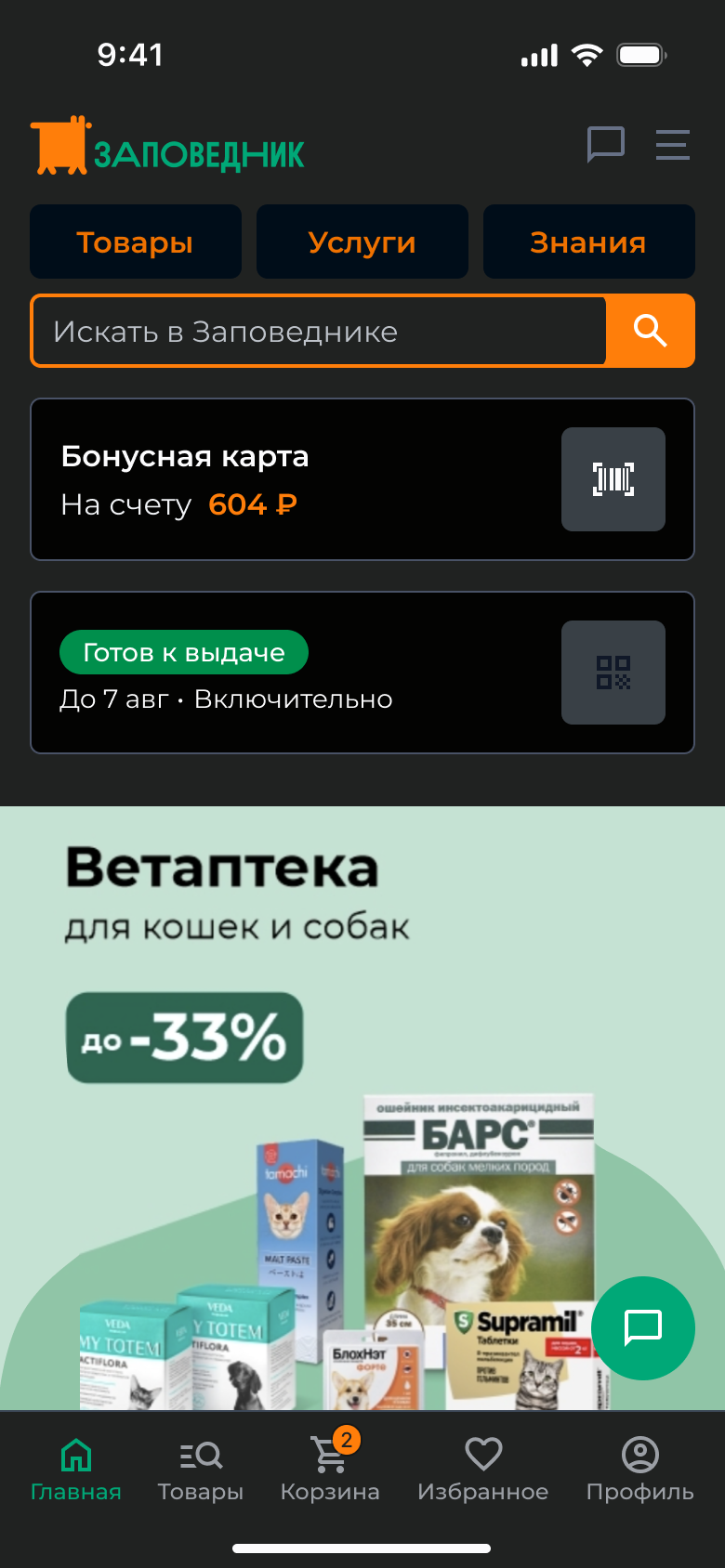 |